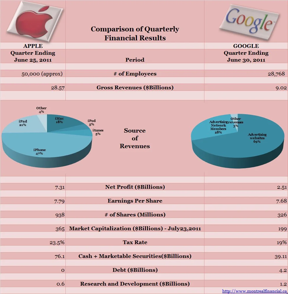
Apple Vs Google: Comparison of Quarterly Results (Infographic)

Apple and Google both had incredible quarterly results for the 3 months ended June 25th (interesting quarter end date) and June 30th respectively.  They beat forecasts by significant margins, continue to expand their operations and have massive amounts of cash on their balance sheets with virtually no debt.  The infographic below presents some key figures of interest.  It is interesting to note that while Apple is almost twice the size of Google, based on Market Capitalization, their Earnings per share is virtually the same.  The majority (68%) of Apple's sales come from the iPhone and ipad , while almost all of Google's sales come from advertising.  Another interesting distinction for this quarter is that while Apple spent 2% of its gross revenues on  R&D, Google's investment in R&D was about 13%.

Apple vs google results comparison
Ronika Khanna

Ronika Khanna is a Chartered Professional Accountant (CPA), Chartered Financial Analyst (CFA), and the founder of Montreal Financial. Her previous experience includes roles at PwC and ING both in Montreal and Bermuda.

She started her business 15 years ago with a focus on accounting, finance and tax for small business owners, startups, freelancers, and the self-employed. As a small business owner herself, Ronika leverages her firsthand experience to offer practical advice and bring clarity to complex financial concepts.

She has been featured in media outlets such as CBC, the Toronto Star, and The Globe and Mail and has authored several books to help small businesses with their finances.

You can connect with her via her biweekly newsletter, Twitter, YouTube, and Linkedin.

She also offers consultations to small business owners and individuals who want personalized guidance.

https://www.montrealfinancial.ca/about
Previous
Previous

5 Notable Disclosures in Groupon’s Financial Statements and What They Mean.

Next
Next

20 Interesting Financial Facts About Google